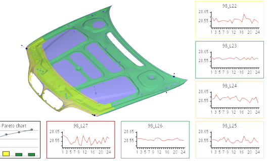
Singleton Labs

Version 2.8.0. More coloring features for MonarchCharts

2010-06-29, by Kristina

 2.8.0 version updates


  • Smooth shading for 3D Surface chart - now 3D Surface can be colored in smooth shading style(continues, gradient coloring).
    Smooth shading for 3D Surface chart
    Smooth shading for 3D Surface chart.

  • Automated chart coloring by selecting main color (themes) -  you can select a chart color theme on toolbar control and coloring schema will be applied automatically. Immediate preview is available while  navigating the color theme list.
    Chart coloring theme list
    Selecting the charts coloring theme

  • Chart colors can be defined using CMYK values. There is possible to define color by CMYK values on toolbar control or define CMYK color space on code.
    Custom Color selection
    Custom color selection

  • New plug-in to save charts as TIFF format images.

  • Texts can be defined using html tags (size, color).

  • The option to highlight the middle tick on a math axis.

  • Feedback posting from the demo application  - now you can  send messages with attached screen shots to  Singleton Labs developer support team directly from demo application.

Version 2.7.0. I'm happy to announce new exciting features » RangeGaps in axis, Axis label grouping and more

2010-05-28, by Darius

Version 2.7.0 updates

New Features
  • Range breaks - use RangeBreak in axis when you want to show values that differ in orders of magnitude like units and thousands - RangeBreak will detect and skip the Y axis portion where no data values are present so that your unit values are still readable.
Axis Range break
Axis range break.
  • Axis labels can be grouped - useful when adding categories to your data values.

Axis Range break
Axis label groups

  • Rotated pie labels. When outside labels for pie are not possible, even though I recommend them as they are the most informative, you can use inside labels option. Rotated labels provide the best fit inside pie segments. Use pie charts with caution - they are not the best way to visualize more than 10 values. 
Axis Range break
Rotated Pie labels
  • SPC line plot chart. This is a Statistical Process Control specific chart, which is a part of our MonarchCharts SPC extension for manufacturing quality control.
Axis Range break
SPC Line Plot

As usual - samples and documentation were updated to reflect recent changes.

Take a look at Zoom/Scroll bar control and other cool features in the latest 2.6.0 version

2010-04-03, by Darius

Version 2.6.0 updates
  • Zoom/Scroll bar control - now you can use MonarchCharts scroll bar for zooming in and out.
Zoom/Scroll bar control for 2D charts
Scroll/Zoom control for 2D charts.
  • Anti-aliased 3D charts - anti-aliasing produces great results when used with small charts.
Anti-aliased 3D chartsAnti-aliased 3D charts
Anti-aliasing on and off.
  • Mixed 2D and 3D charts in the same ViewGrid - now making impressive charts is easier then ever!
Zoom/Scroll bar control for 2D charts
2D and 3D chart combinations.
  • New samples with full source code in ChartsDemo, illustrating the features above.

MonarchCharts version 2.5.2 released

2010-03-09, by Kristina

New Features for 3D PIE series
  • Auto labels layouter.The labels will be positioned automatic:
Outside: if labels text too large for slice
Inside:   if labels text fit to slice.

pie.setLabelLayouter(Pie3DLabelsLayouters.LABELS_AUTO);
  • Alternative color for labels font.
Added additional style tag for label font (ALTERNATIVE_COLOR). The initial color will be used then pie labels are inside, alternative color then outside.


3D Pie fetures
Auto positioned labels and alternative color for Pie 3D labels.
  • Fixed DataModel range.

MonarchCharts version 1.8.2 Update released

2010-03-04, by Kristina

Support request initiated release

Label layouter fix
Problem was : The
Labels connection lines were rendered incorrectly: the line ended at the top of label rectangle. It  was a problem, when label rectangle was not rendered.
After solving problem: The labels connection lines are drawn at the bottom of label rectangle.


MonarchCharts version 1.8.0 Update released

2010-01-21, by Kristina

Labels position settings  fix for 2D BarSeries.

The labels can be positioned :

  •   inside the bar;
  •  outside the bar;


Label position on Barseries Label position on BarSeries
                   Label position on BarSeries                                                  Label position outside BarSeries

MonarchCharts version 2.5.0 released

2010-01-08, by Kristina

New Radar - Polar series for 2D released

A Radar chart is a graphical method of displaying multivariate data in the form of 2D chart of three or more quantitative variables represented on axes starting from the same point.

A Polar Chart is a circular graph on which data is displayed in terms of values and angles (radians).
 
Radar-Polar series Radar series
               Polar series                                                                              Radar series

MonarchCharts update 2.4.1 released

2009-12-31, by Kristina

 New updates :
  •  label marker alignment.
  •  cylinder shape for 3D Bar Series.


                           Cylinder 3D Bars                                                            Label markers alignments example

MonarchCharts version 2.4.0 released

2009-12-11, by Kristina

New Feature for 2D charts style editing - ToolbarControl.
 
The ToolbarControl allows you to easily change chart appearance directly in your application, without coding:
  •   change text font style, font size,color;
  •   change chart elements foreground and background colors;
  •   save changes to stylesheet files;
  •   load changes from saved stylesheet files;


MonarchCharts version 1.7.11 Update released

2009-11-24, by Darius

Support request initiated release
Stacked axis fix for BarSeries.
Fixed was an issue with stacked BarSeries using horizontal bar orientation.

MonarchCharts version 2.3.1 released

2009-11-23, by Darius

 Minor fixes prior to major version release
Fixed AxisAutoAdjuster issue.
Fixed java.util.Date to java.sql.Date class cast issue.

MonarchCharts version 2.3.0 released

2009-10-26, by Kristina

 New Surface series for 3D released.

This type of chart shows trends in values across two dimensions in a continuous curve.

The Surface3D series:

  • Can be filled with an automatic or user defined color palette.  The colors in this chart represent specific ranges of values.
  • Can set wireframe style ;
  • The Markers are available on Surface 3D series;
  • The walls of the chart can  be formatted;

The Null value in surface can be drawn :
  •   leaving empty holes in the charts;
  •   using interpolation of null values;
  •   using minimum possible value of the scale;

3D Surface Surface3D with holes 
                    Surface3D with solid wall                                                      Surface 3D with null value - empty holes

Surface3D with filled holes Surface3D wireframe               
             Surface 3D with null value - filled holes
                                    Surface3D - wireframe style used

MonarchCharts version 2.2.0 released

2009-10-02, by Kristina

The new series and features released:
  • Vector series for 3D charts;
  • Pie series for 3D charts;
  • Floating Bar for 3D charts;
  • Multilevel Label Axis.
  • Dot Plot Chart

3D Pie Flotating Bar 3D
                    Pie series for 3D Charts                                              Floating Bar for 3D series

Multi Level Layouter  Dot Plot Chart
                 MultiLevel Layouter for Axis                                                 Dot Plot Chart

MonarchGraph version 1.5.0 released

2009-09-16, by Kristina

 The MonarchGraph  tested with 1.5 and 1.6 Java.

MonarchCharts version 2.1.1 released

2009-09-04, by Greta

New Feature for Drawing 2D Splines

From now on, some segments of a 2D spline function can have null values. Those null-segments can drawn in several ways:

  •      can be not drawn at all leaving an empty gaps in the chart,
  •      drawn using the different style compared to regular segments of the spline, or
  •      drawn using the same style for all the segments of the spline.

In case the null-segments are drawn, the spline smoothly interpolates between the boundary know values of the spline.


MonarchCharts version 2.1.0 released

2009-08-28, by Kristina

MonarchCharts SPC (Statistical Process Control ) extension (see it here)

Extending MonarchCharts is easier then ever. After receiving numerous requests from our customers, we have released the MonarchCharts extension for Statistical Process Control (SPC).

SPC extension features

np, p, c, u, XbarS, XbarR, Individual Moving Range, Pareto, Historgram, Scatter, Box & Whiskers charts.

Extension is available FREE of charge to all current MonarchCharts customers with active support accounts.

MonarchCharts version 2.0.3 released

2009-07-16, by Darius Peckys

New Website Released

2009-06-10, by Vytautas Jakutis

We are glad to announce you that today a new version of our website was released. New look, convenient gallery browser, new content, and some new examples.
Bookmark and Share
Twitter